Buy
Call To Action

Overview

The Call To Action Widget takes all your hassle in making of advertising and marketing element in web page. You can fully customize this widget and use any where in the page because the scope of this widget is very large due to full customization.

Screenshot

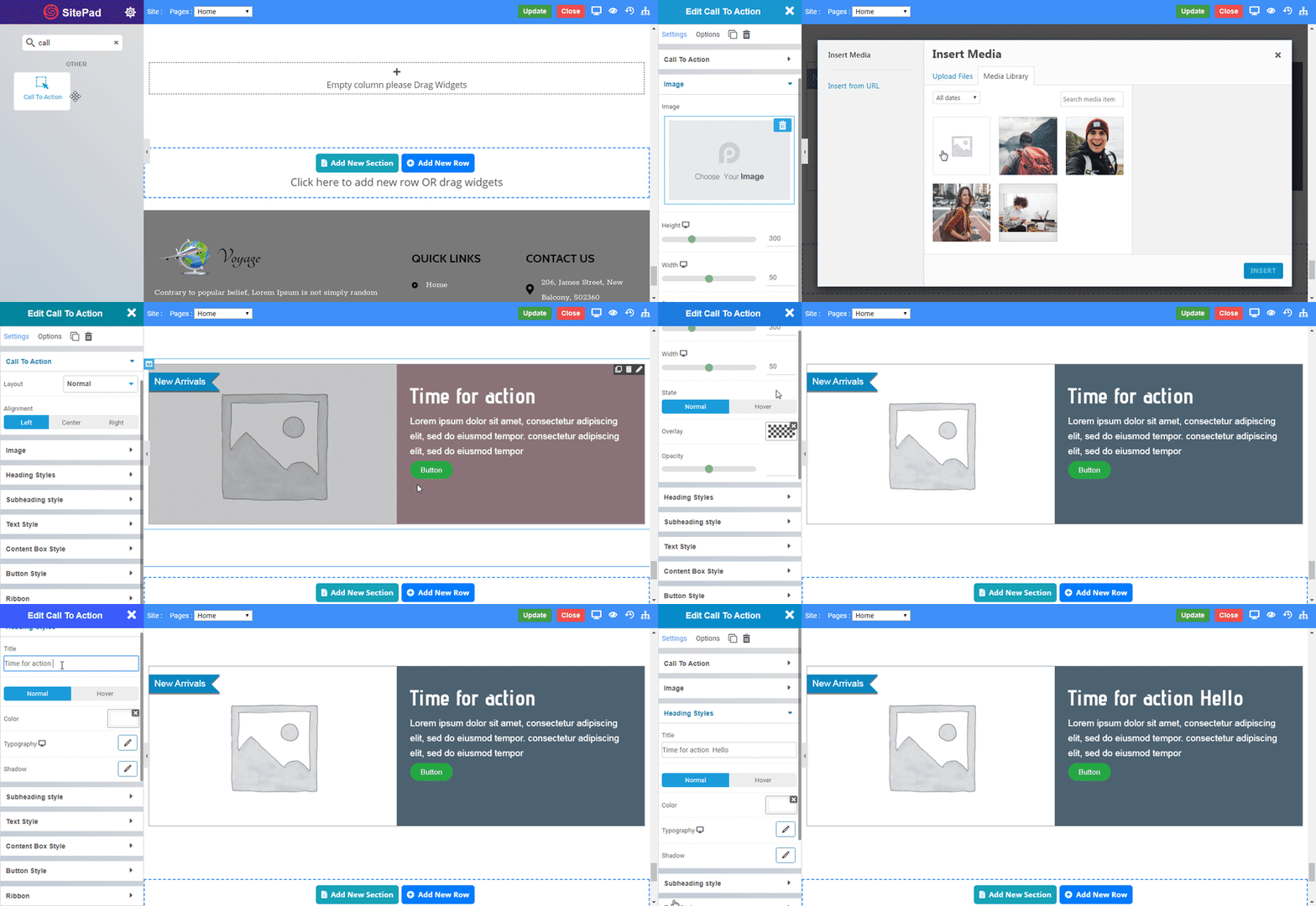
The following is a GIF video to show you how to use the call to action widget and the various options available :
call to action1

Call to Action Widget

The following is a call to action widget :

New Arrivals
Time for action

Lorem ipsum dolor sit amet, consectetur adipiscing elit, sed do eiusmod tempor. consectetur adipiscing elit, sed do eiusmod tempor

Button

Options

Call to Action

  • Layout : Select option to change layout of call to action (CTA).
  • Alignment : Select the alignment of CTA, default is left.

Image

  • Image : Select the image you want to display.
  • Width : Set the width of the image.
  • Height : Set the height of the image.
  • State : Select the state in which overlay effects has to be displayed viz. Normal or Hover.

Normal

  • Overlay : Set color of overlay for image.
  • Opacity : Set opacity of overlay.

Hover

  • Delay : Set delay for hover.
  • Overlay : Set color of overlay for image.
  • Opacity : Set opacity of overlay.
  • Hover Animation : Select animation for overlay hover.

Heading Style

  • Title : Enter the title of (CTA).

Normal

  • Color : Set the color of the title text.

Hover

  • Delay : Set delay for color of title.
  • Color : Set the color of the title text.
  • Typography : Set the font and text style of title.
  • Shadow : Set the shadow of title.

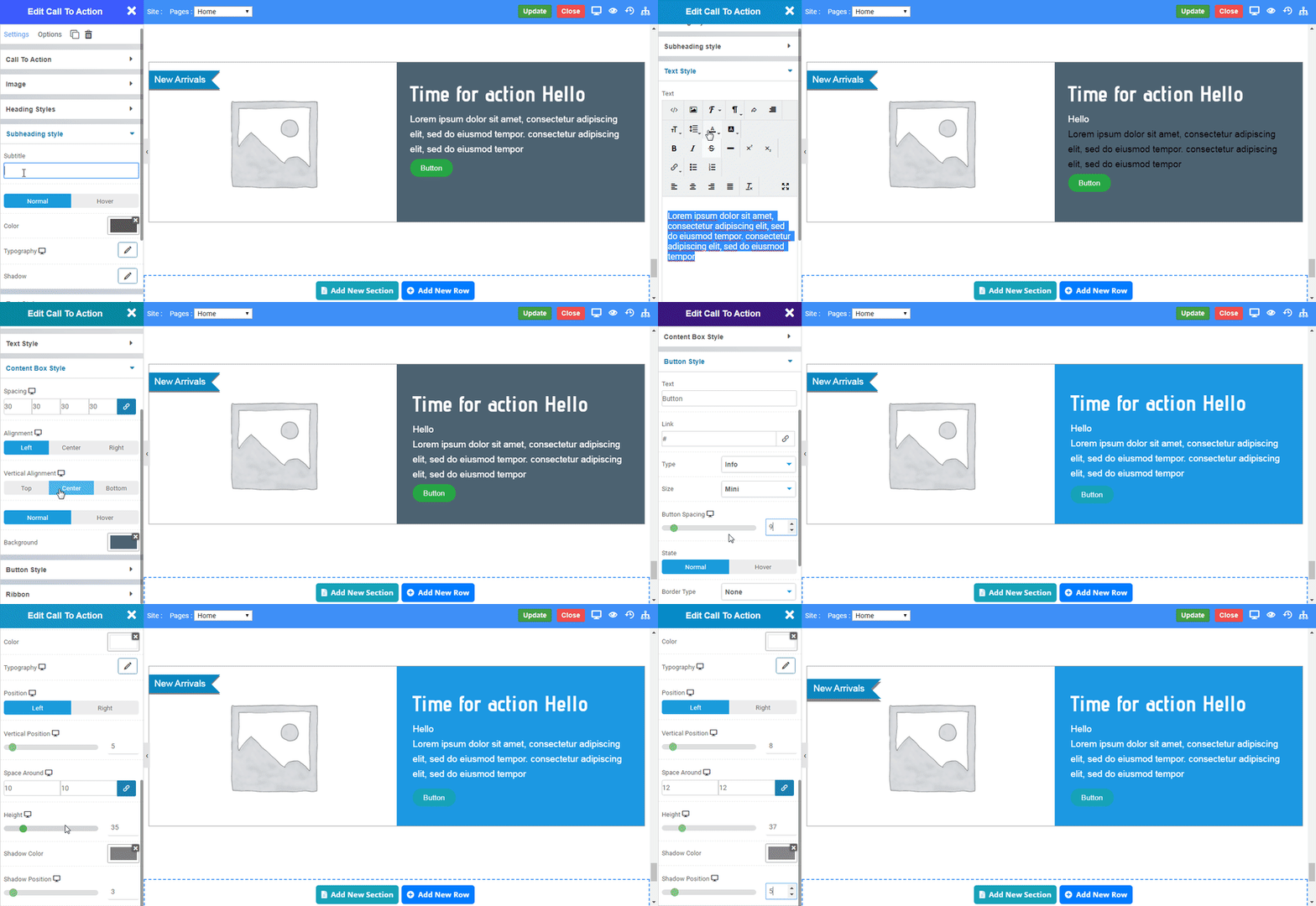
Subheading Style

call to action2
  • Subtitle : Enter the subtitle of (CTA).

Normal

  • Color : Set the color of the subtitle text.

Hover

  • Delay : Set delay for color of subtitle.
  • Color : Set the color of the subtitle text.
  • Typography : Set the font and text style of subtitle.
  • Shadow : Set the shadow of subtitle .

Text Style

  • Text: Enter text and edit the text. CLICK HERE to see the styling effects of text.

Content Box Style

  • Spacing : Set the spacing around the content box.
  • Alignment : Select the alignment of content box, default is left.
  • Vertical Alignment : Select the vertical alignment of content box.

Normal

  • Background Color : Set the background color of the content box.

Hover

  • Delay : Set delay for color of title.
  • Background Color : Set the background color of the content box.

Button Style

  • Button Text : Enter the Button text.
  • Link : Enter the URL for Button link.
  • Type : Select the type of buttons to begin your design. CLICK HERE to see the types of button.
  • Size : Select the Size of button, default is selected to mini. CLICK HERE to see the size of button.
  • State : Select the state in which button effects has to be displayed viz Normal or Hover.
  • Border Type : Choose the border type. CLICK HERE to see the types of border
  • Border Color : Set the Border Color.
  • Border Width : Set the width to control the thickness of the border around the button.
  • Border Radius : Set the border radius to control corner roundness.

Ribbion

  • Show Ribbon : Enable the toggle to display ribbion in (COA).
  • Text : Enter the ribbon text.
  • Background Color : Set the background color of the ribbon.
  • Color : Set the color of the ribbon text.
  • Typography : Set the font and text style of ribbon text.
  • Position : Choose the position of ribbon.
  • Vertical Position : Set the vertical position of ribbon.
  • Space Around : Set the space around ribbon text.
  • Height : Set the height of ribbon.
  • Shadow Color : Set color of ribbon shadow.
  • Shadow Position : Set position of ribbon shadow.
    Was this page helpful?
    Newsletter Subscription
    Subscribing you to the mailing list