Overview
Display the key information where ever it is needed in a page with a Tooltip Widget that can be triggered on mouse hover, to add an extra little design quirk or a hint to your webiste.
Screenshot
The following is a GIF video to show you how to use the tooltip widget and the various options available :

Animated Heading
Stroke
Animated Heading
Shadow
Animated Heading
Rotate-1
Animated Heading
EffectsRotates&More
Rotate-2
Animated Heading
EffectsRotates&More
Rotate-3
Animated Heading
EffectsRotates&More
Loading-Bar
Slide
Clip
Animated Heading
EffectsRotates
Zoom
Animated Heading
EffectsRotates&More
Scale
Animated Heading
EffectsRotates&More
Push
Animated Heading
EffectsRotates&More
Options
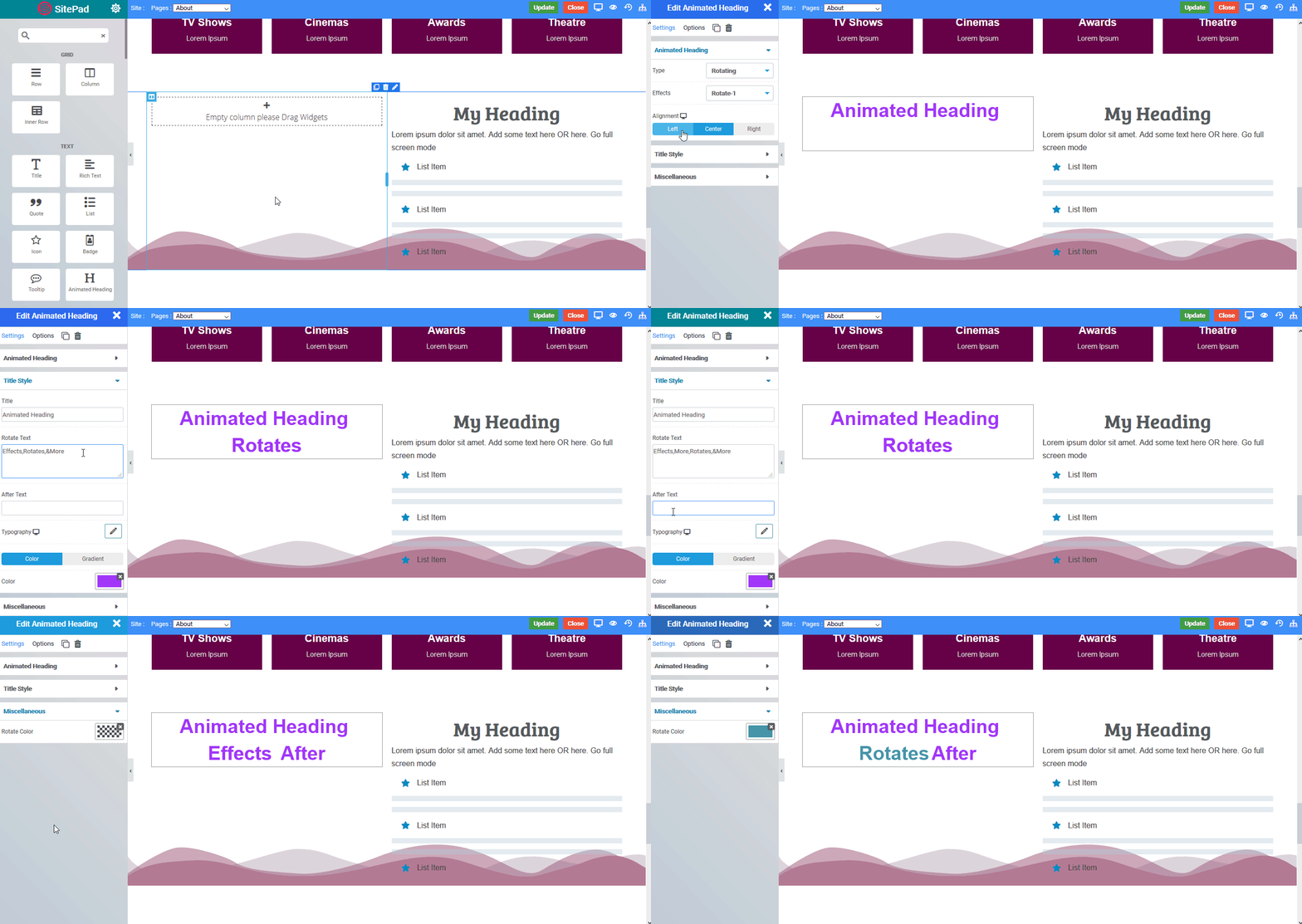
The following are the various options we have for the widget :
Animated Heading
- Type : There are 2 types - Effects and Rotating headers
- Effects : Various effects are available. If you choose Effects type above then you have Blobs, Stroke and Shadow. If you choose Rotating Type then you have Rotate-1, Rotate-2, Rotate-3, Loading-Bar, Slide, Clip, Zoom, Scale, Push
- Alignment : Choose the alignment of the heading from Left, Center, Right
Title Style
- Title : The title text
- Rotate Text : Comma separated values of Rotating Text
- After Text : Any text after the rotating text
- Typography : Choose the font styles
- Color Or Gradient : You can also set the color or give a gradient to the text
Miscellaneous
- Rotate Color : The color of the Rotating text
- Blob 1-9 Color : Color of various blobs you can choose if you have chosen the blob type effect
