Buy
Button

Overview

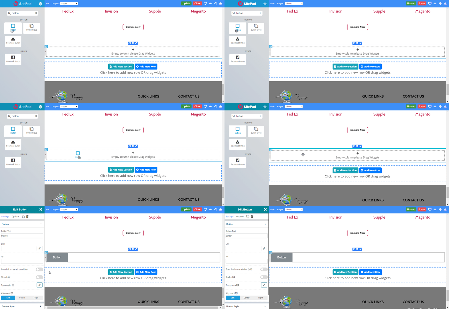
The Button Widget allows you to easily design and customize the buttons without any other plugins or shortcodes. Inside button you can even put text, icon and can modify or customize as per your need.
button_overview

Options

Content

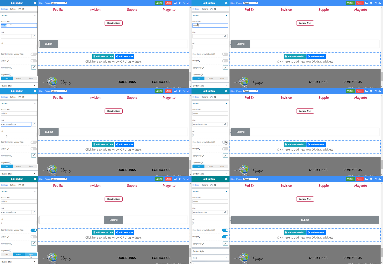
  • Button text : You can insert text to the button eg. Submit, Reset etc.
  • Link : Set link to the button displayed.
  • Rel: The rel attribute specifies the relationship between the current element and the linked element.
  • Open Link in New Tab: Enable to open the specified link in new tab of your web browser or vice versa
  • Stretch : Enable to set the button width as 100% of your display resolution.
  • Typography : Set the typography eg. Font family, Font size, etc. to the button displayed.
  • Alignment : Set the alignment of the button eg. Left, Center, Right.
  • Left: Set the button widget to left.
  • Center: Set the button widget to center.
  • Right: Set the button widget to right.
button_content

Button Style

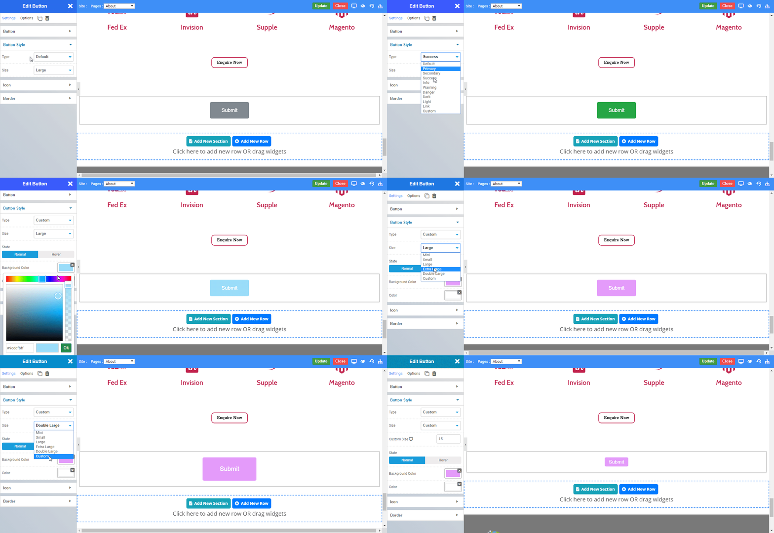
You can style your button with the following types and size.
button_style1
  • Button Type
  • Default : If nothing specified, the button is set as Default.
Submit
  • Primary : Primary Button indicates the primary actions.
Submit
  • Secondary : Secondary Button indicates the secondary actions.
Submit
  • Success : Success Button indicates success or positive actions.
Submit
  • Info : Success Button indicates success or positive actions.
Submit
  • Warning : Warning Button indicates caution which should be taken with this action.
Submit
  • Danger : Warning Button indicates caution which should be taken with this action.
Submit
  • Dark : Dark Button indicates a button to be dark.
Submit
  • Light : Light Button indicates a button to be light.
Submit
  • Link : Link Button makes a button look like a link.
Submit
  • Custom : Custom Button allows you to design the button in Normal and Hover State.
Submit
  • Button Size
  • Mini : Set the size of the button to Mini.
Submit
  • Small : Set the size of the button to Small.
Submit
  • Large : Set the size of the button to large.
Submit
  • Extra Large : Set the size of the button to extra large.
Submit
  • Double Large : Set the size of the button to double large.
Submit
  • Custom : To set the size of button as per User-defined but it should be less then hundered.
Submit

Icon

  • Icon : Set the icon to be displayed on a button with text.
  • Alignment : Set the alignment of the icon eg. Left, Right.
  • Left: Set the icon to left.
  • Right: Set the icon to right.
  • Space Between : Set the space between icon and text in the button.
button_icon1

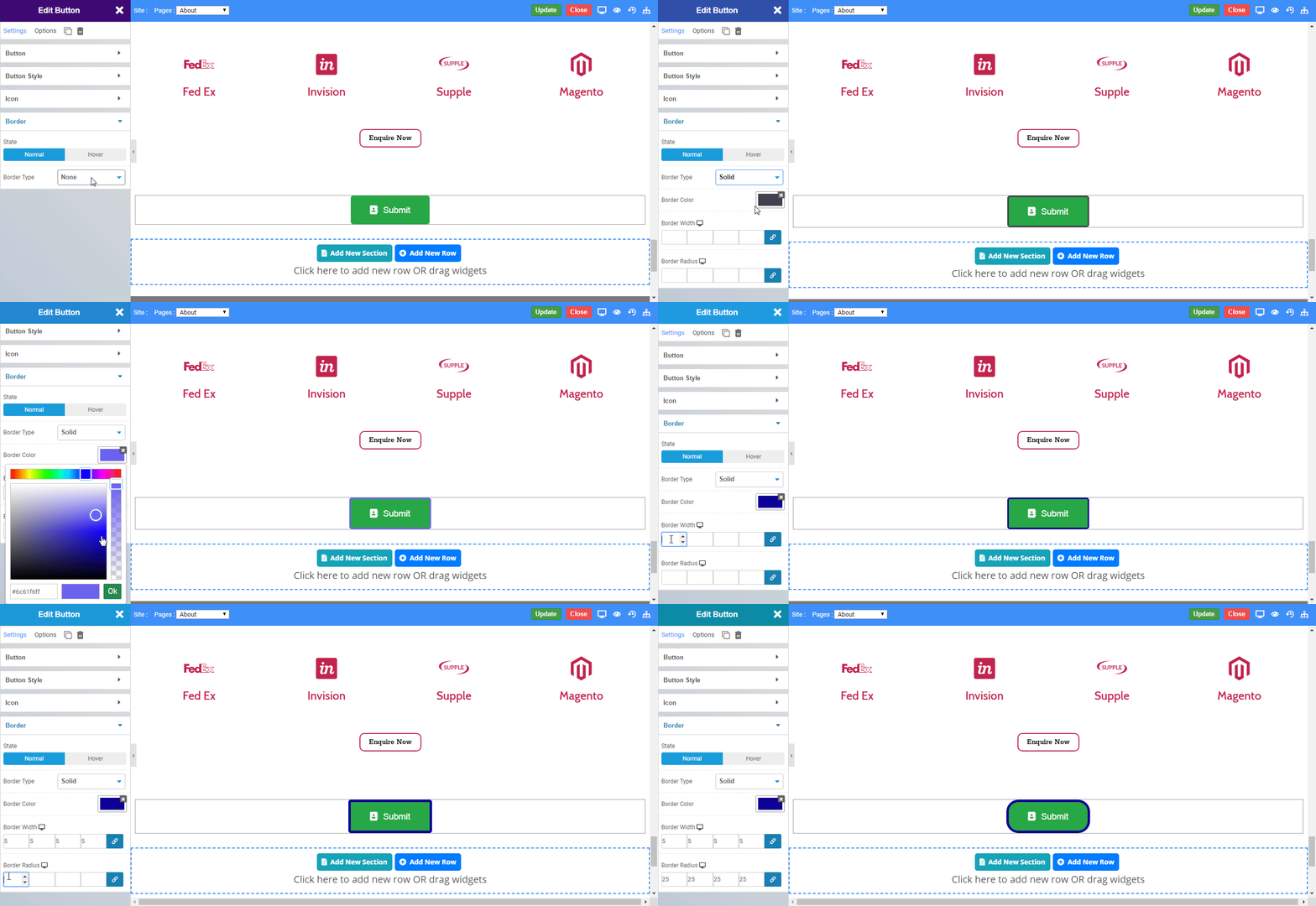
Border

  • State : Set the state in which you have to set a border.
  • Normal: Border effects will visible in Normal State as always.
  • Hover: Border effects will visible in Hover State.
  • Border Type : Set the type of Border you want, viz. Solid, Double, Dotted, Dashed, Groove.
  • Solid

Solid Border

  • Double

Double Border

  • Dotted

Double Border

  • Dashed

Dashed Border

  • Groove

Groove Border

  • Border Color : Set the color of the border.
  • Border Width : Set the width of the border in pixels.
  • Border Radius : Set the radius of the border.
button_border
    Was this page helpful?
    Newsletter Subscription
    Subscribing you to the mailing list