Overview
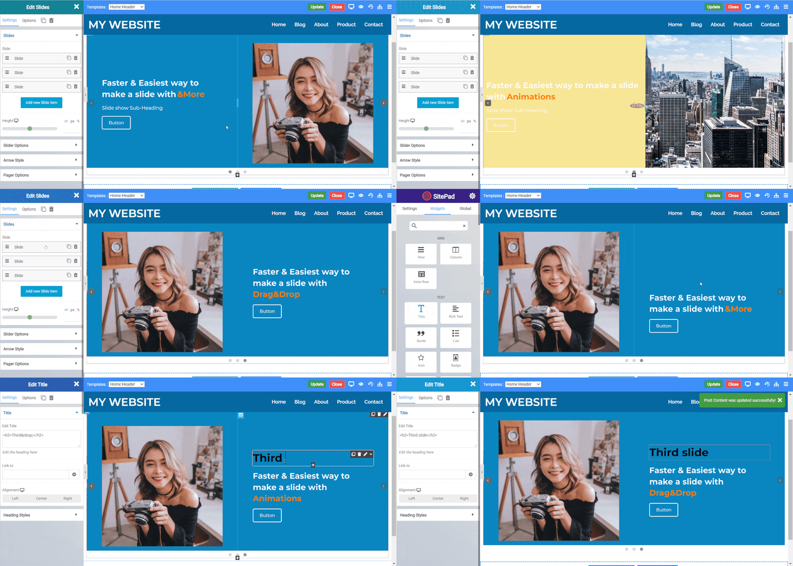
In Content slider you can simply drag and drop widgets with the flexibility to make the slides the way you want.
Steps to use Content Slider
- Search for Slides Widget and then drag and drop it in the editor.
- You will get a basic template of 2 slides, you can drag and drop other widgets in the slides or edit the already placed template.
- The default height of the slides is 80vh you can change that with the height option.
Content Slide options
- Background Type : Its of 3 types Color, Image, Gradient.
- Ken Burn Effect : Ken burn is a background image effect in which the image grows in scale in a defined speed.
- Background overlay : It is used to add a layer of color over the background.
- Blend Mode : Blend mode is used in combination with background overlay so create effects of blending of color with the background.
Arrow Styles
- Background Type : This option sets the background of the arrow navigation.
- Color : This option sets the color of the arrow.
- Arrow Size : It sets the size of the arrow.
- Background Size : It sets the size of the background shape of the arrow.
- Position : The arrow navigation can have 4 kind of position Default, Custom, Top and Bottom.
- Icon Type : It lets you set the icon type which is of 2 type Default and Custom, Custom lets you set icon from a list of icons
Pager Options
- Dot Radius : Sets the radius of the dot in the pager.
- Position : Sets the position of pager, Bottom Position is the default.
- Dot Height : Sets the height of dot.
- Dot Width : Sets the width of dot.
- Dot Size : Sets the height and width equally of the dot.
