Overview
Display the key information where ever it is needed in a page with a Tooltip Widget that can be triggered on mouse hover, to add an extra little design quirk or a hint to your webiste.
Screenshot
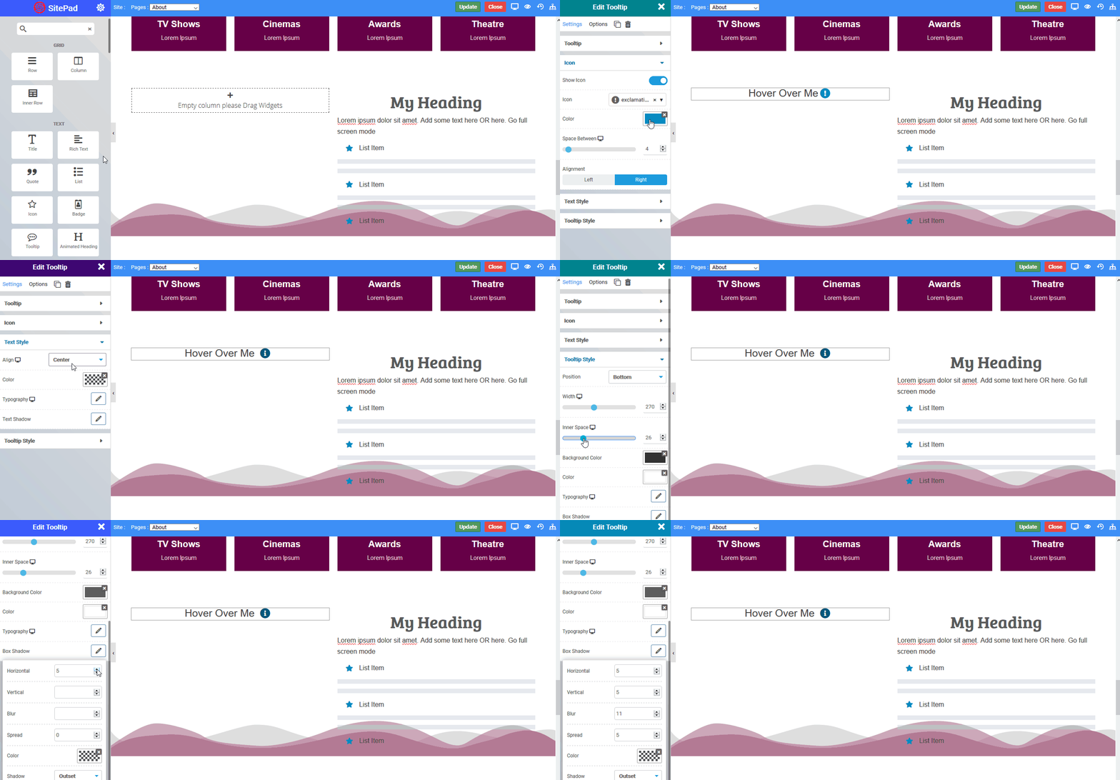
The following is a GIF video to show you how to use the tooltip widget and the various options available :

Options
The following are the various options we have for the widget :
Tooltip
- Text : Enter the Hover text on which tooltip will hover
- Content : Enter the tooltip text content
Icon
- Show Icon : If you want to show icon next to your hover text you can enable it through by just clicking on the slider button
- Icon : Choose the Font Awesome icons from the options available in the drop down
- Color : Set the icon color
- Space Between : Set the space between the hover text and selected icon
- Alignment : Align the icon to the left or the right of the Hover text
Text Style
- Align : Align the Hover text to left, right or center
- Color : Set the color of Hover text
- Typography : Choose the typography for Hover text
- Text Shadow : Set the text shadow effect to Hover text
Tooltip Style
- Position : You can set the tooltip position to the left, right , top or bottom the selected Hover text
- Width : Set the width of the tooltip
- Inner Space : Set the space from the top and bottom inside the tooltip
- Background Color : Choose the background color for tooltip
- Color : Set the tooltip content text color
- Typography : Choose the typography for tooltip content
- Box Shadow : Set the shadow property to tooltip box
